Redesigning an internal platform to improve usability and streamline workflows.
ROLE:
UX/UI Designer
DURATION:
X weeks
TEAM:
4 personas
SCOPE:
Research, UX, UI, Testing
Overview
Redesign of an internal platform used to manage employee benefits through a modular system.
Context
Used multiple times a day, the platform is a key part of users’ daily workflows.
Challenge
Complex navigation and unclear structure made it difficult to complete tasks efficiently.
About the Project
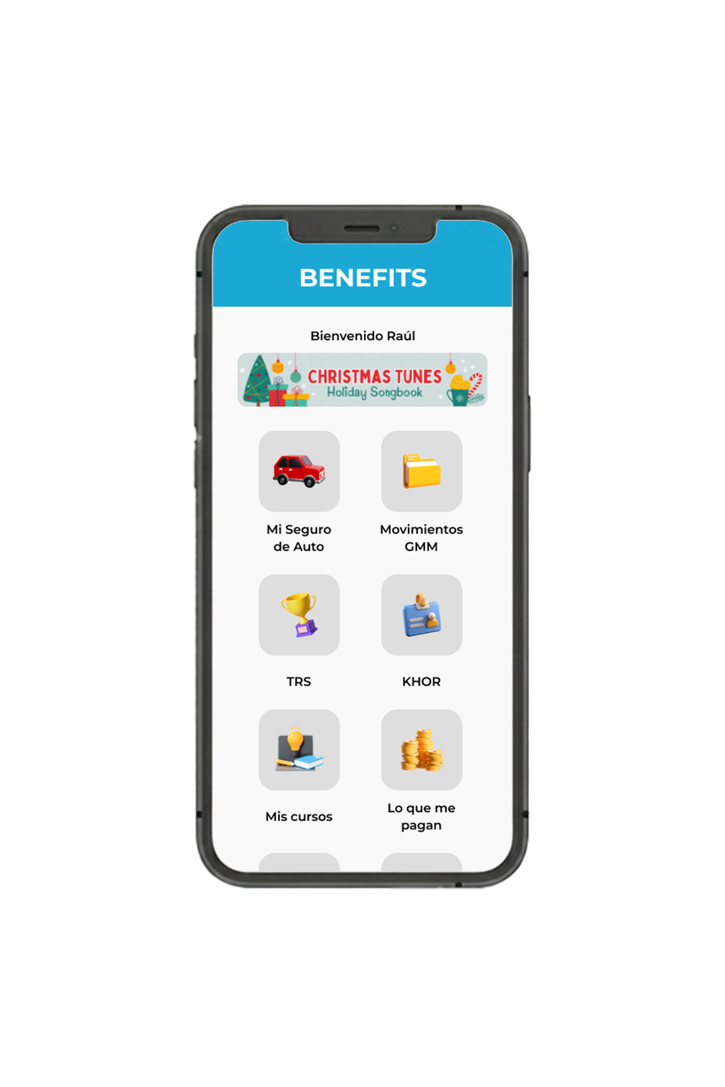
The problem
Navigation was unclear and unintuitive
Users struggled to complete tasks
High cognitive load across workflows
Research & Insights
Methods
Usability testing (5 users)
Task-based scenarios
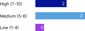
Key Insights
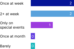
How frequently do you use the app?
Frequency of the app uses
Most users struggled to identify the correct module due to unclear structure.
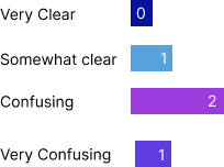
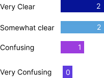
How clear are the platform modules?
Confusing modules
Most users struggled to identify the correct module due to unclear structure.
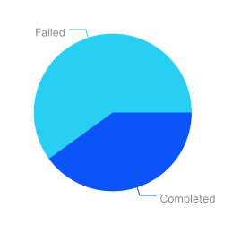
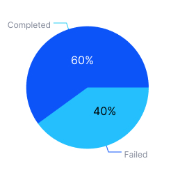
Task completion success
Tasks success
Users experienced difficulty completing key actions due to unclear navigation flows.
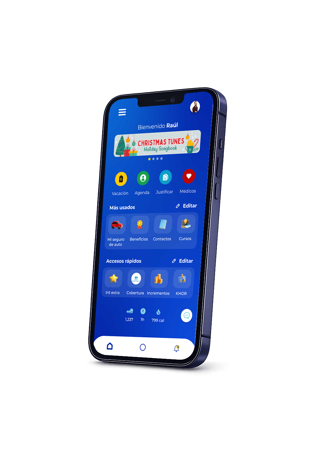
Design Decision
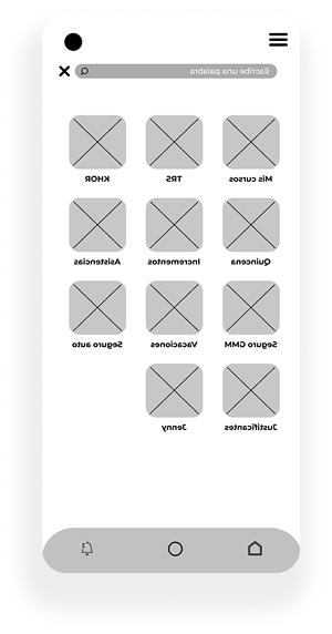
Reorganized the platform into clearer categories
Reorganizing Information Architecture
Simplified module structure to reduce cognitive load
Flexible UI for Different User Profiles
Adapted interface for varying levels of digital familiarity
Introducing Alternative Navigation Paths
Introduced search and shortcuts to improve task efficiency
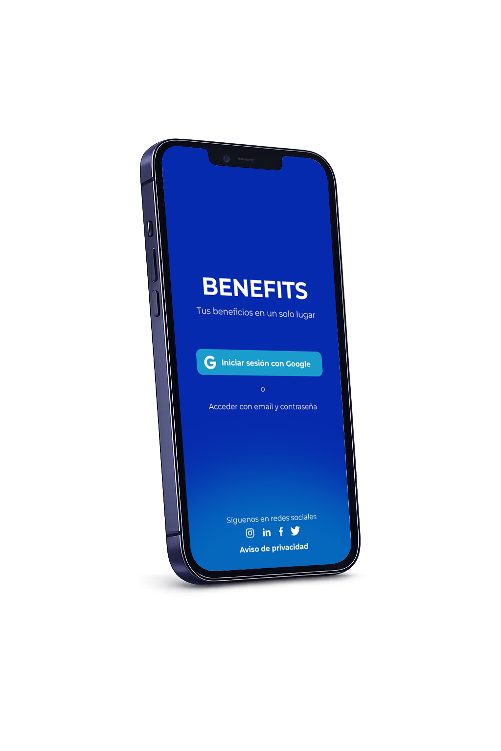
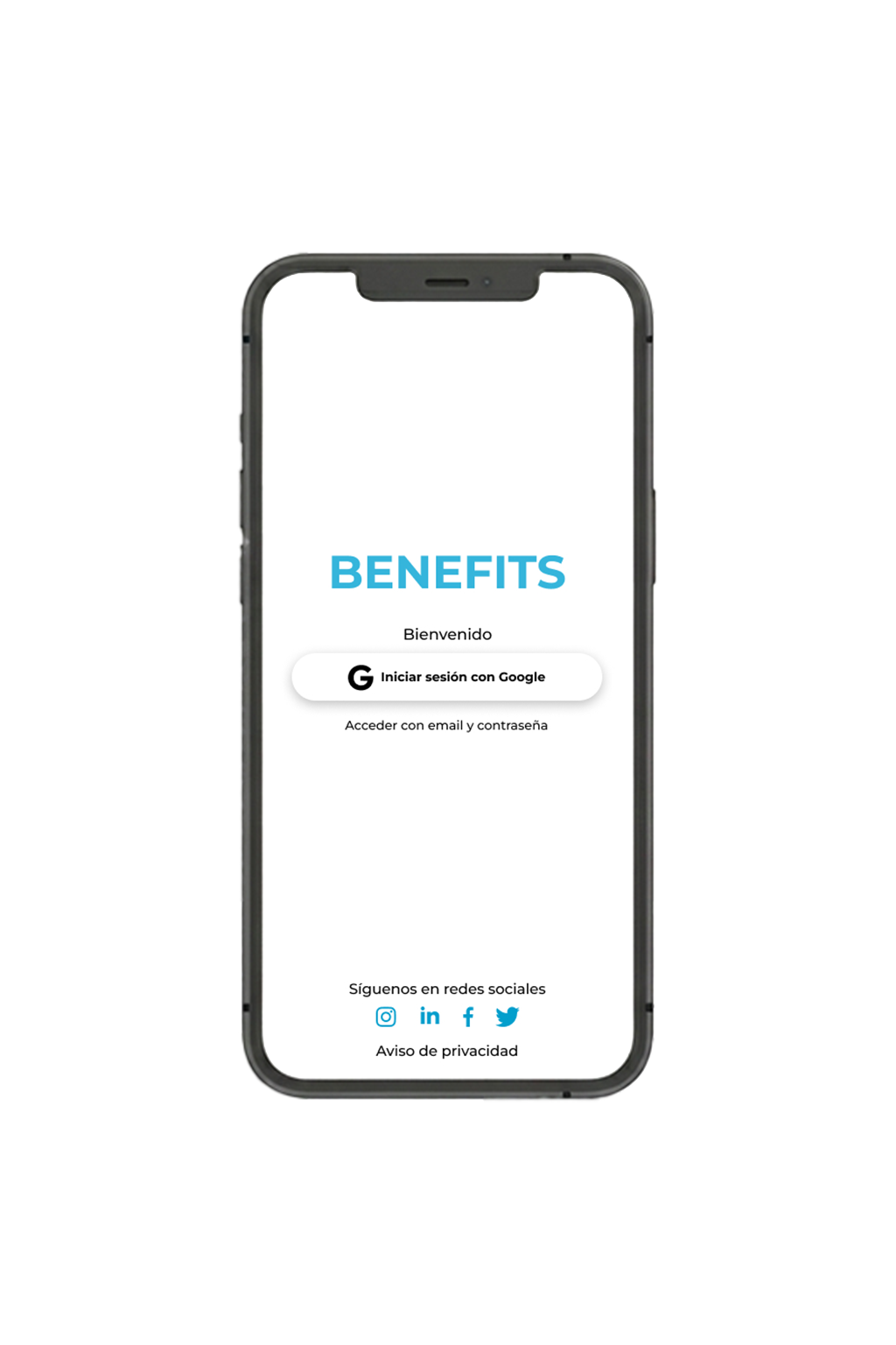
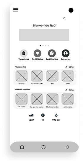
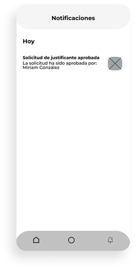
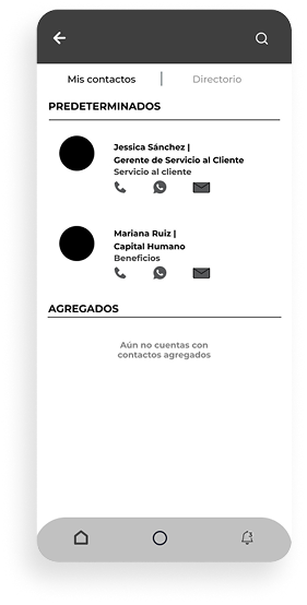
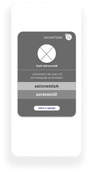
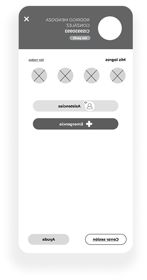
UI Design
Designed a clean and flexible interface focused on clarity, accessibility, and efficient navigation.
Prototype
Interactive prototype showcasing the redesigned navigation and simplified workflows.
Results
Simplifying the platform structure and improving navigation significantly increased task success, reduced confusion, and improved overall user satisfaction.
User Satisfaction 60%
Improved overall user satisfaction.
Module clarity +44%
Improved understanding of platform structure.
Tasks success 60%
Increased task completion rate after simplifying navigation.